My role in the project was to take an existing application from any realm possible (desktop, tablet, mobile, coffee machine…) and redesign it using the emotional design principles. As the application, I chose something I use every week if not every day: Splitwise. I then created wireflows and an emotional map of the application and made it more emotional.
Background
The project aimed to choose an application that I used every day and redesign it to apply the emotional design principles. I chose Splitwise as my application as it is something that I use every week if not every day.
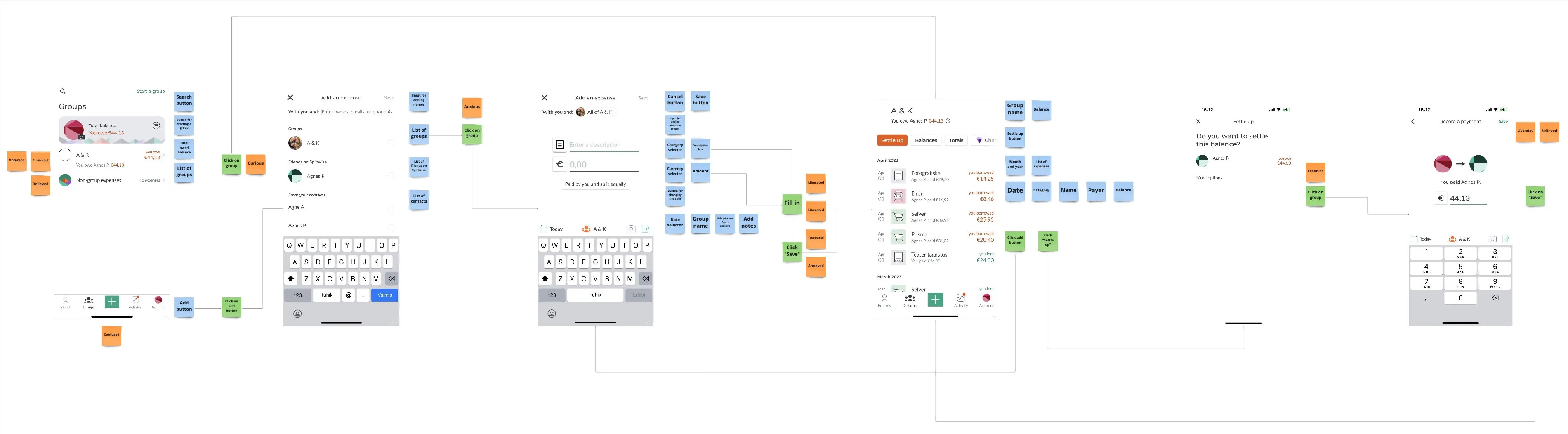
When creating the interaction map, I also created an emotional map of the application – which emotions I felt during adding an expense or settling expenses in the application. The main emotions I found were:
- → Curious (whether I’ve had any new expenses)
- → Confused (the expense-adding flow got confusing at times)
- → Relieved & Liberated (when settling up)
Defining new emotions
Me and my coursemates at IxD.ma did an exercise where we went through everyone’s application and everyone could add feedback or ideas for the application. The result looked very nice and colorful (my column is the first one on the left):
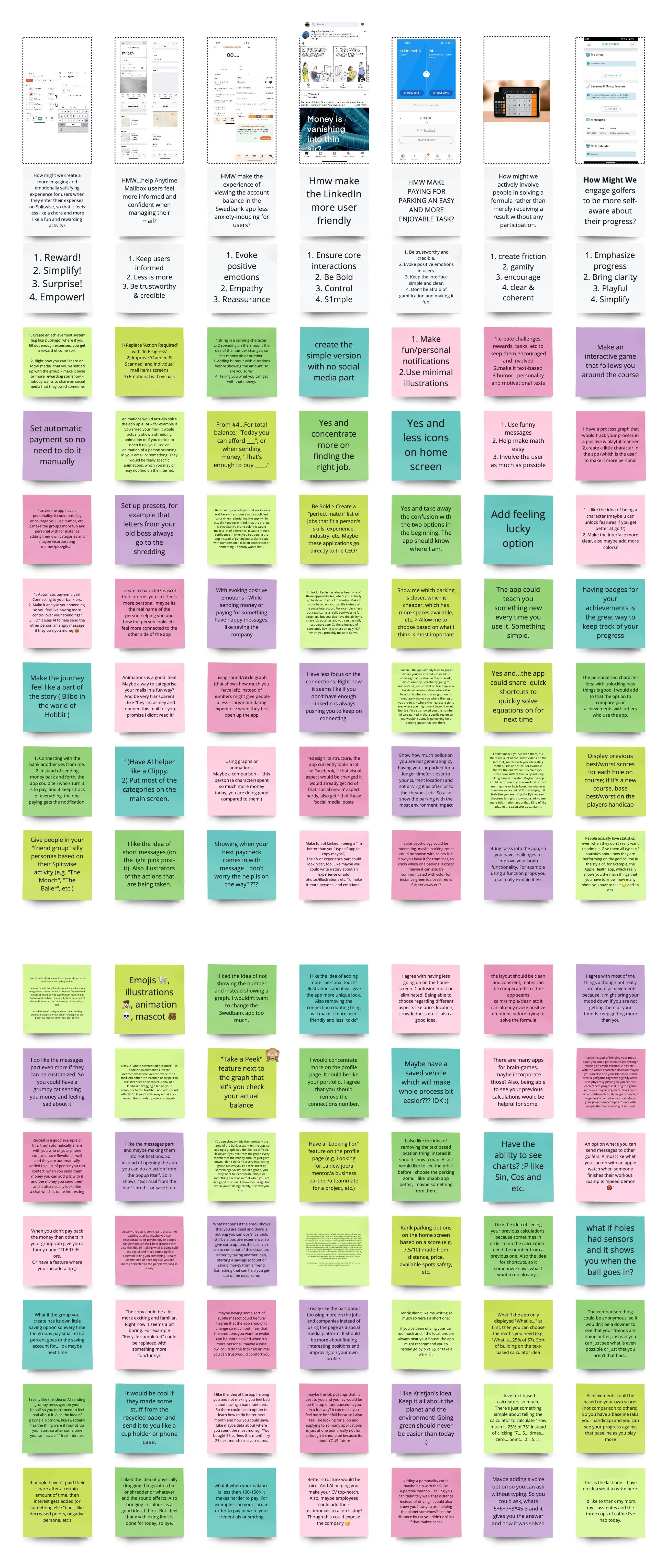
As you might see from the image, I created a how-might-we question and 4 simple design principles to guide me on my way. The how-might-we question was the following:
How might we create a more engaging and emotionally satisfying experience for users when they enter their expenses on Splitwise so that it feels less like a chore and more like a fun and rewarding activity?
And the four design principles guiding me on my way were:
- – Reward!
- – Simplify!
- – Surprise!
- – Empower!
There were lots of great suggestions from my coursemates. I packaged them all into one and got the result.
Result
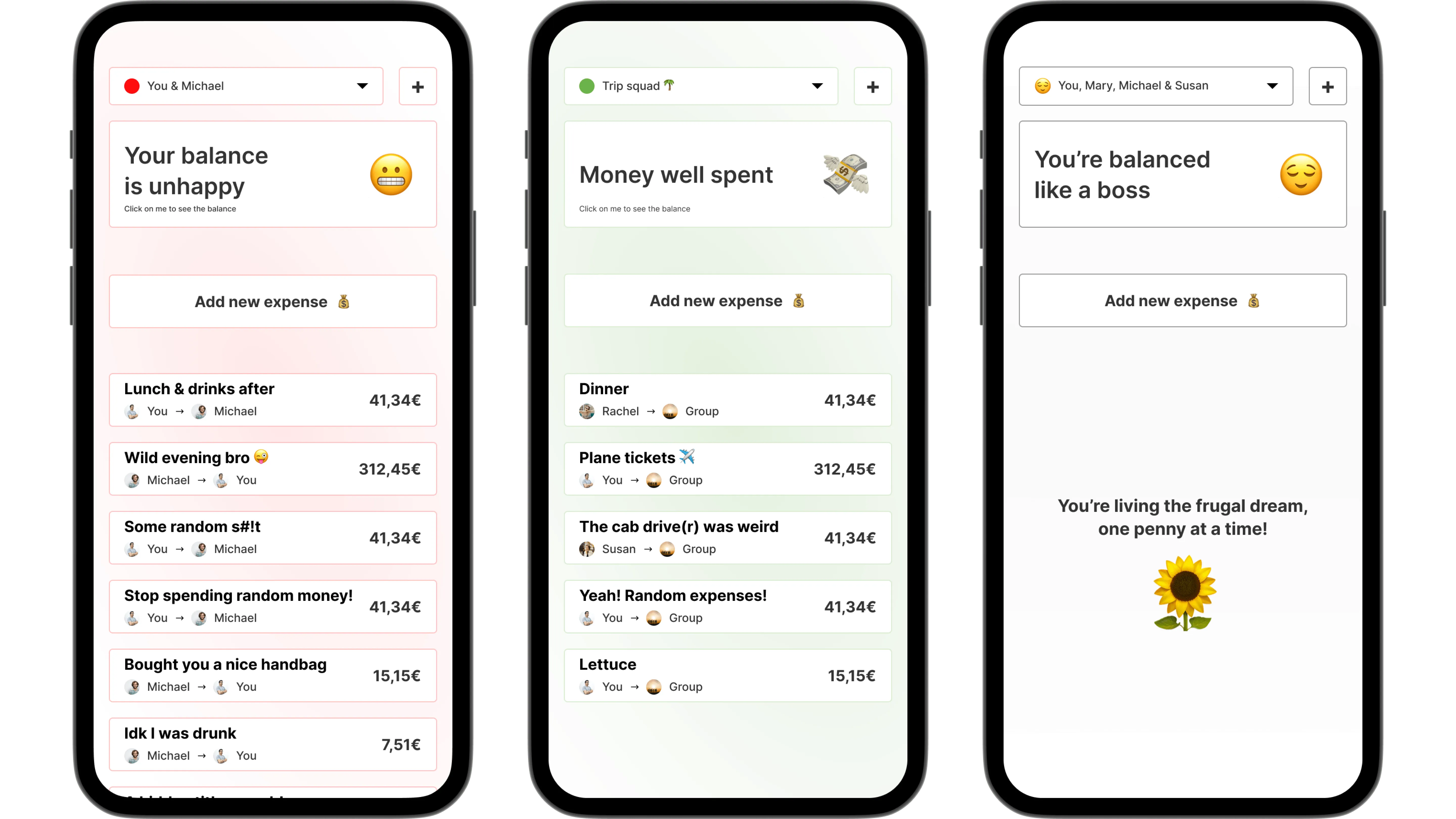
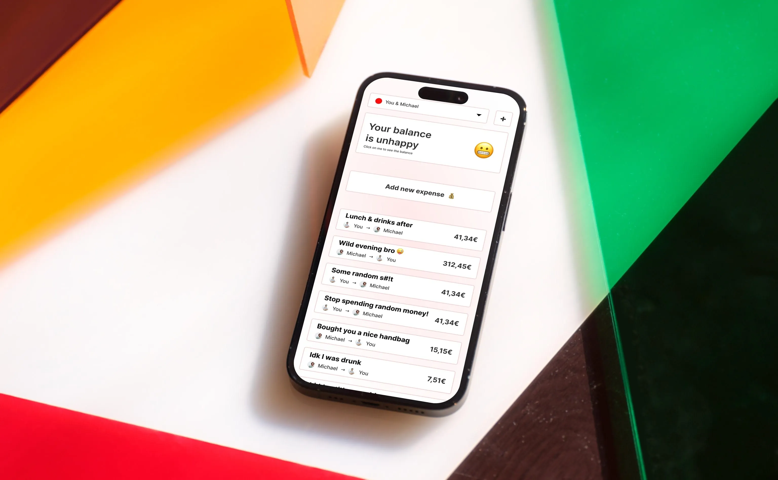
With the subtle background color, I hoped to evoke the sense of urgency, but at the same time, show a quick overview. Same with the colored dots in the dropdown – at a glance you can see whether you’re in a “good position” or a “bad position”. The emojis will also show what thebalance is and will try to evoke a sense of understanding.
I also hid the balance of the group or with your friend behind a click so it wouldn’t be the first thing you see when opening the application. It is sort of a way to procrastinate paying up, but also reduces the anxiety around immediately having to pay up.
In the Figma board, which is below, I also created a couple of notifications to remind the person about the balance.