The goal of this project was for me to choose an application and redesign it, while keeping in mind the basics of visual design: typography, Gestalt principles, colors, and their use cases, etc. This project was one of the first thorough introductions to visual design that I had – I wrote down lots of notes and feel that I learned a lot.
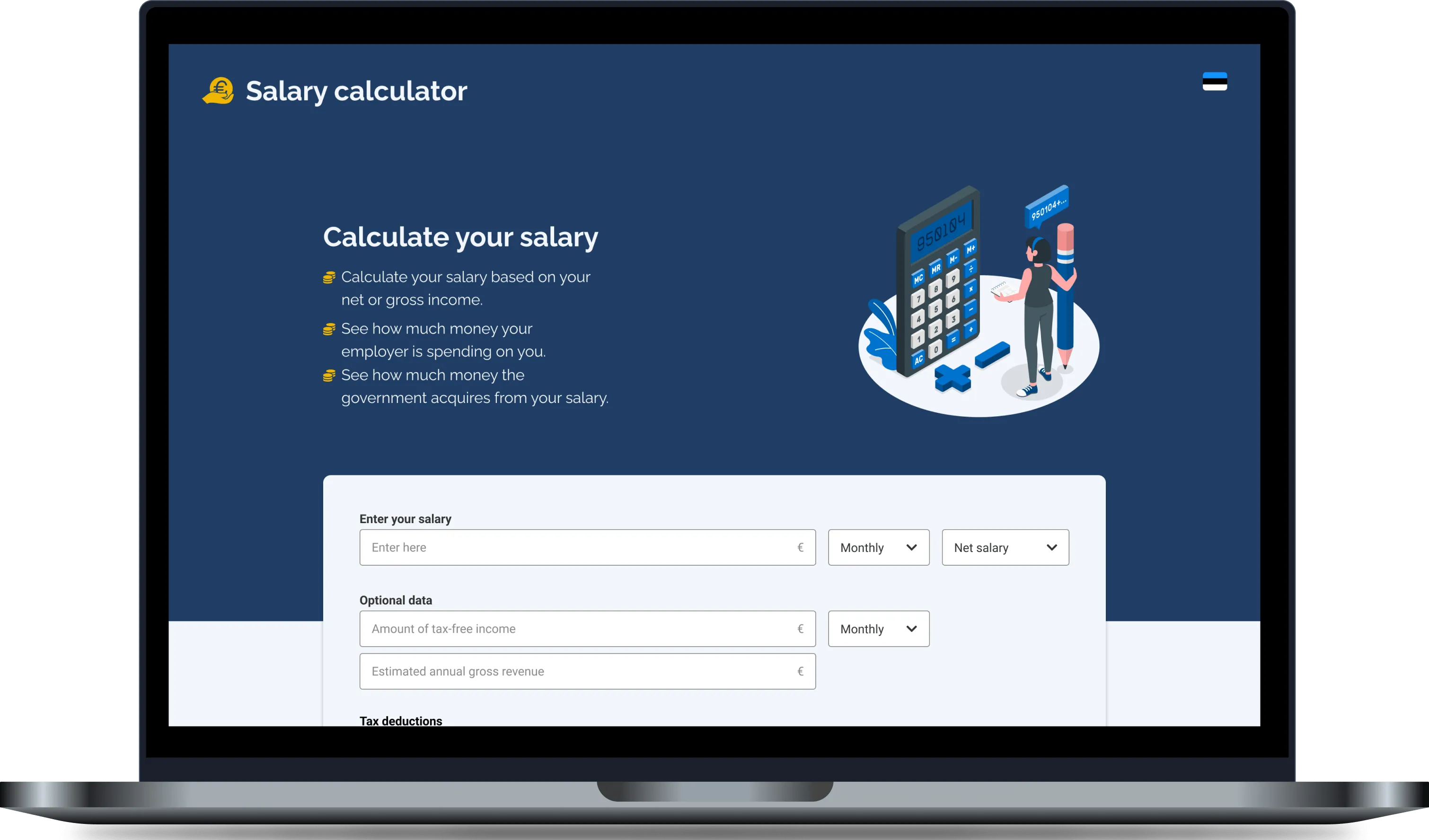
The first iteration
I have to say, at first, I felt very lost when trying to redesign the calculator. The first (filled out) iteration of the calculator looked like this:
I did make a UI kit, and tried to choose colors that might fit with the money and confidence theme (blue-ish colors), however, there were some very odd mistakes, e.g. the “pie chart” looked very odd and the text on the right wasn’t explanatory enough.
Needless to say, the empty state looked quite weird as well – the area on the right would not have had data unless the form was filled out, so it was taking up unnecessary space.
So I went to Pinterest and Dribbble for some inspiration, and with that the second iteration was born.
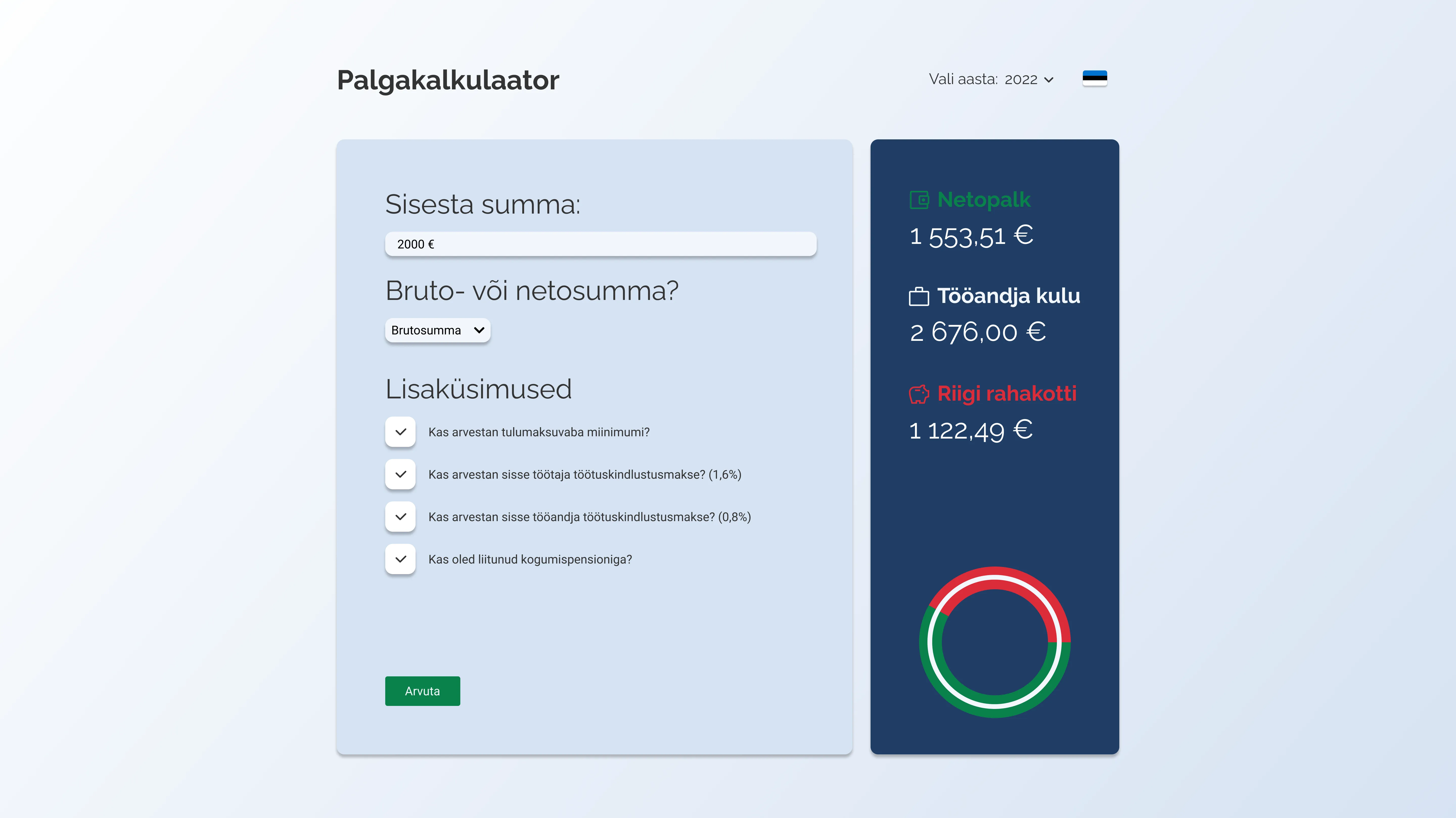
The second iteration
And here’s a screenshot with the data filled in:
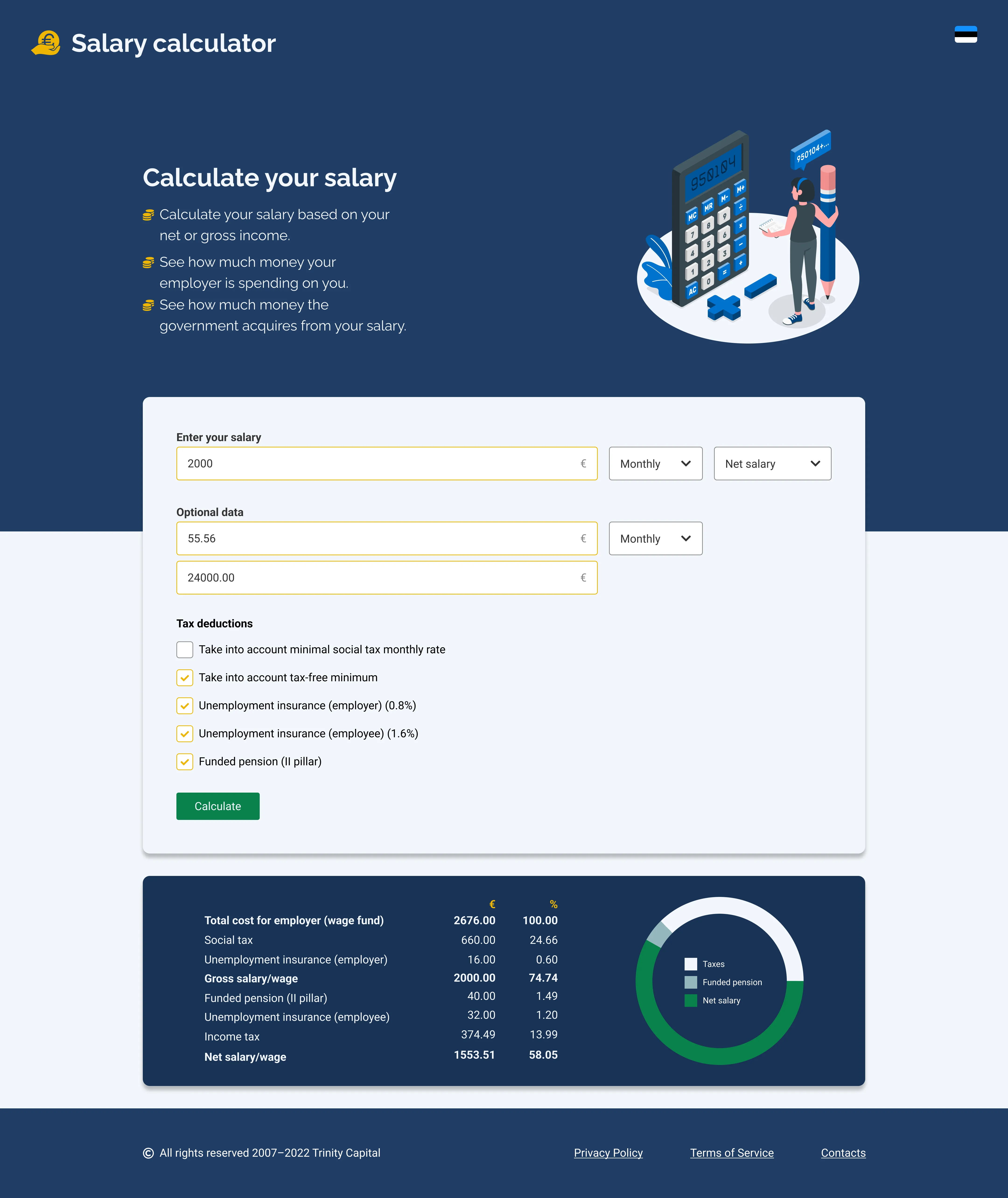
I am happier with how the second iteration turned out. I saw some great examples on the web and learned my first lesson in design:
You sometimes have to steal like an artist.
I got better feedback and our mentors said that this was a huge step up from the initial version and that they’re happy to see progress. Of course, there were still odd parts, e.g. the salary input being too long (because who would have millions, right?) and the pie chart part appearing at the bottom of the form (which might make it not as visible), but those were just nitpicked.